SolarAid brand refresh
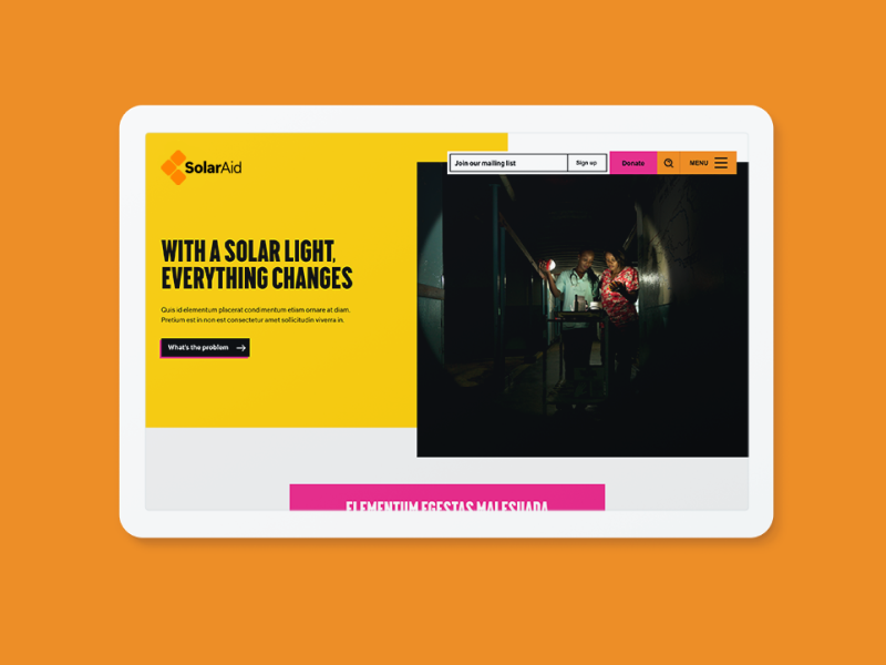
After successfully redesigning and rebuilding the SolarAid site while at Fat Beehive, we proceeded to refresh their logo and visual identity based on the website design.
I introduced a vibrant new colour palette, ensuring accessible usage was included in the guidelines. The two typefaces are clear and highly legible at all sizes, as is the improved logo.
We also created a flexible and immersive campaign template, allowing content creators to tell multiple stories but without having to commission new builds.
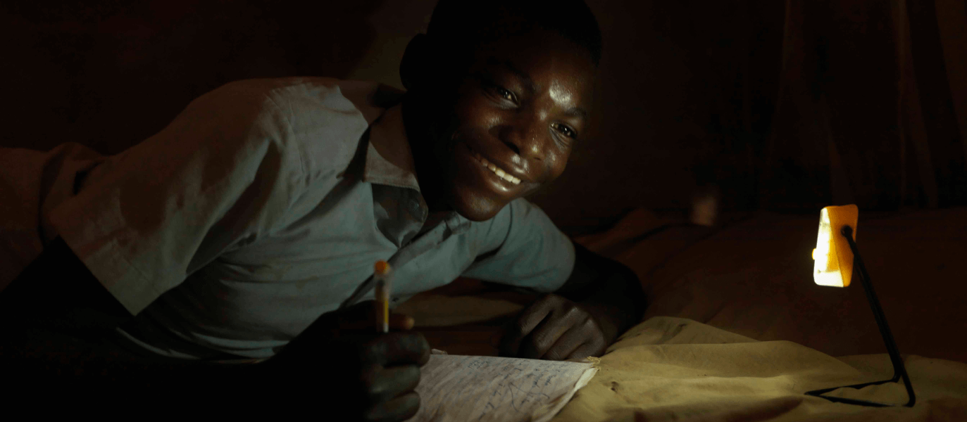
Key to the website design was linking to their marketing message of ‘from darkness to light’. So we created a hover effect on desktop images that reveals them in a circle of light, like a solar light has been switched on.
The website design and front-end build was by Andrew Halloway while under my creative direction at Fat Beehive.
We dramatically improved their ‘impact calculator’ through design and storytelling, giving them a unique tool in the charity world – one that allows users to see the impact of their donation before committing to it.


