Greenpeace UK website
A bit of a boyhood dream this one. I created user personas, user journeys, ran information architecture (IA) workshops and helped inform content strategy, while balancing different stakeholder needs – always prioritising user needs.
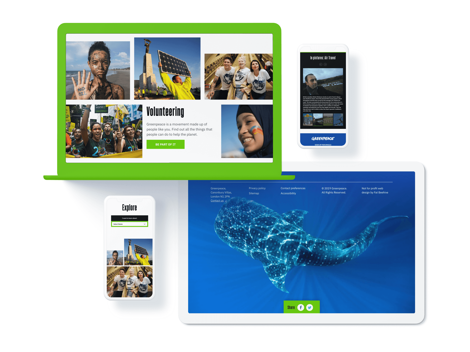
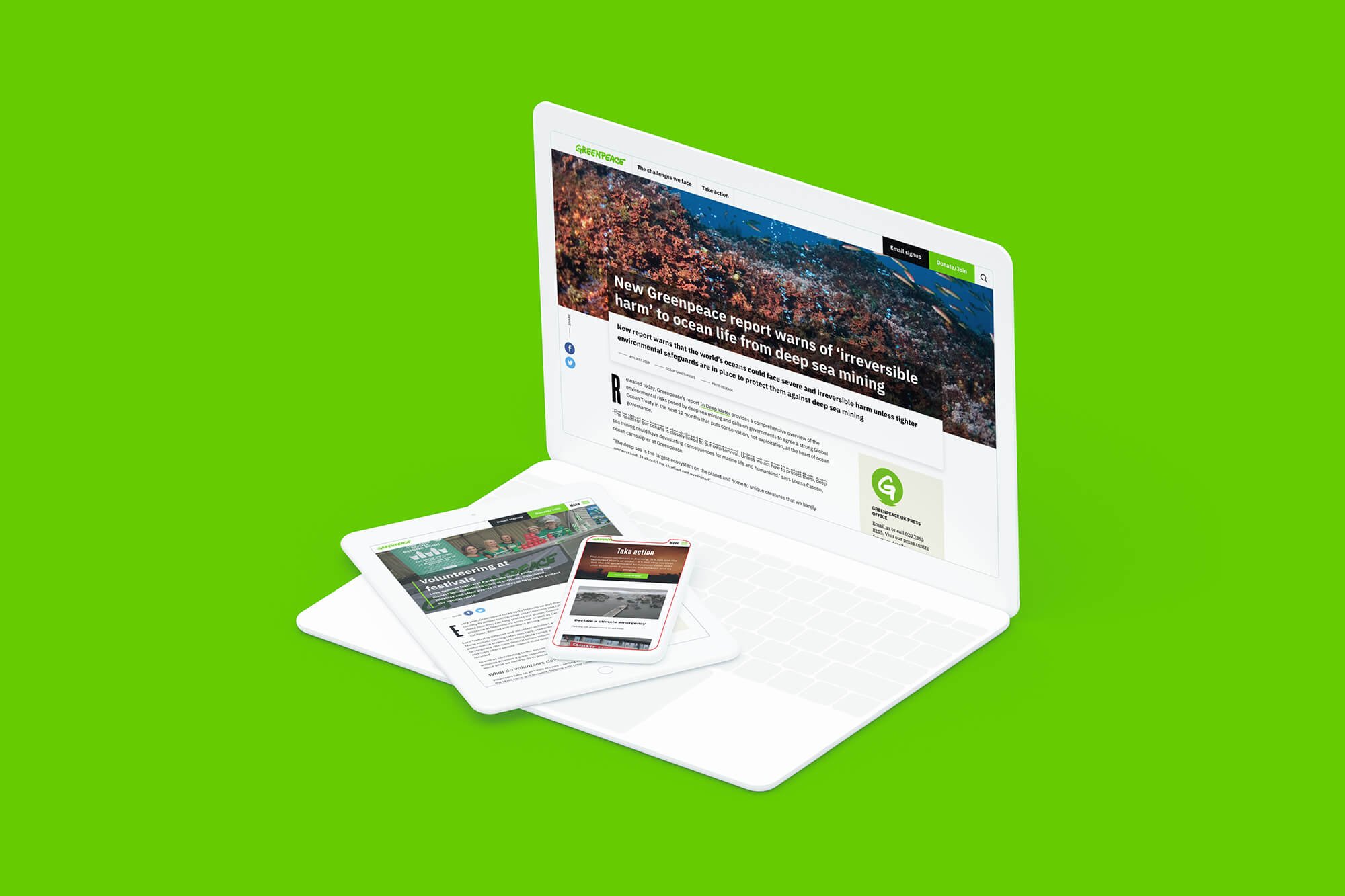
The new Greenpeace UK site design simplifies typography and provides a range of well-designed and flexibly components to tell a range of stories.


